Get Started with Storybook.js and Angular (w/ Tailwind CSS)
A Simple Guide to Integrating Angular Components Into The Storybook Design Ecosystem


Introduction
Recently I've been soaking up as much about Angular as can find time to as I'm a bit new to the framework (and will be starting a job soon where I'll be working with it). This process lead me to wonder how to integrate Storybook.js into Angular apps. Since I learn better when I document my learning I will summarize my findings here.
Also here is the link to the GitHub repo as well as the live site.
Setting Up an Angular App w/ Tailwind
First, let's create our Angular app and move into it's root directory:
ng n sb-ng-demo && cd sb-ng-demo
Integrate Tailwind Into Our App
Second, let's install and initialize Tailwind:
npm i -D tailwindcss postcss autoprefixer
npx tailwindcss init
Configure Tailwind In Our App
Finally, let's configure the content of the template paths in the tailwind.config.js file:
content: [ './src/**/*.{html,ts}' ]
Now add the Tailwind directives to the global styles in src/styles.css:
@tailwind base;
@tailwind components;
@tailwind utilities;
Create a Simple Button Component
Before we worry about Storybook let's first generate a simple button component that we can later use to test:
ng g c btn
Adding Parameters to The Component
Now let's add a color parameter to the button in its component.ts file:
import { Component, Input } from '@angular/core'; // Import input decorator

@Component({
  selector: 'app-btn',
  templateUrl: './btn.component.html',
  styleUrls: ['./btn.component.css']
})
export class BtnComponent {

  // Add input decorator
  @Input()
  color?: string; // Add color param

}
Adding a Template to The Component
Finally, let's add the template markdown to our button:
<button
    class='text-lg rounded-xl px-4 py-2 mx-6 my-4 text-white shadow-xl border-slate-400/50 border-2'
    [ngClass]="color === 'primary' ? 'bg-blue-700 hover:bg-blue-800' : 'bg-slate-500 hover:bg-slate-600'"
>
  <ng-content></ng-content>
</button>
NOTE: the 'ng-content' tag is for the button's inner text.
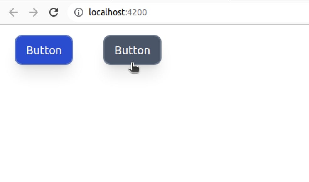
Adding The Component Within Our App
Now let's add our button component to our app in the app.component.html file:
<app-btn color='primary'>Button</app-btn>
<app-btn>Button</app-btn>
Let's also run our app to make sure things are running smoothly:
ng serve --open
It should look like this:
Integrating Storybook.js Into Angular
Now that we have our component to test, let's shift to working with Storybook.
Setting up Storybook.js
First, let's install Storybook.js into our Angular app as well as start it up:
npx sb init

npm run storybook
Create Story for Component
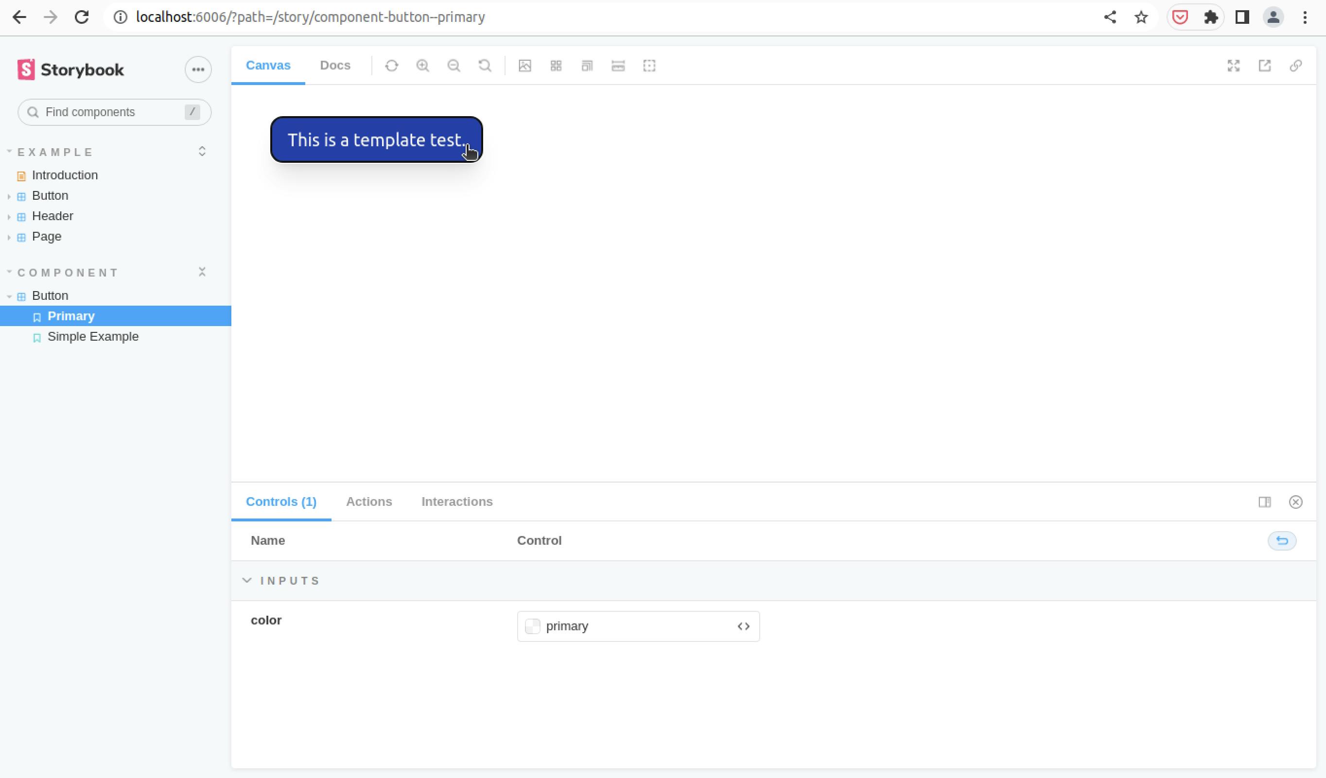
Next, let's integrate our button component into Storybook by creating a file called 'stories/Btn.stories.ts':
import { Story, Meta } from '@storybook/angular/types-6-0';
import { BtnComponent as Btn } from '../app/btn/btn.component'; // Import btn component

export default {
  title: 'Component/Button', // Name the story
  component: Btn,
  argTypes: {}
} as Meta;

const Template: Story<Btn> = (args: Btn) => ({
  props: args,
  // This is our template for our btn:
  template: `
    <app-btn [color]="color">
      This is a template test.
    </app-btn>`,
});

// This displays a simple example of the component
export const SimpleExample = Template.bind({});

// This displays the component with the color as primary
export const Primary = Template.bind({});
Primary.args = {
  color: 'primary'
} as Partial<Btn>;
Using Storybook.js
Finally, visit page localhost:6006 and navigate to Component/Button in the sidebar to view our component.